The Ottawa Senators are quickly approaching their 25th season in the National Hockey League.
And in that time, they’ve had a number of different looks. Some good- the expansion year black and red with the 2D logo or the black heritage uniform they still wear today and some not so good- like the gold-trimmed third jersey or the truly unfortunate SENS look.
But what’s great about a team’s uniform, is everyone has their own opinion- their own preference. When you look back on the Senators and their first quarter-century in the league, is there a particular look that stands out? A certain logo that resonates? A colour that exemplifies the team and the city? Your answers to these questions probably depend on when you started following the team and has probably evolved over time.
But now, as the franchise approaches its 25th Anniversary, there’s an opportunity to re-think the branding around this hockey team. A chance to establish a look that appeals to the organization’s history but that’s also an identity that this team can carry into the future. Consistency is important but so too is having a look that fans can be proud of. With that in mind, I’ve been sent an impressive proposal for some options the organization can consider heading into the future.
Before we get to the proposals, a quick Q&A with the LeCollectif Design and Rocket 57, the people behind these ideas!
***
Q- Maybe before we get into the specifics of the designs, let’s do a little introduction. Your names will probably be familiar to many Sens fans but how about a quick intro.
JB: I’m Jacob Barrette, a Gatineau based graphic designer (Le Collectif Design). I’ve worked on a number of projects ranging from The National Gallery of Canada to branding local establishments like Brothers Beer Bistro and everything in between for the past 11 years. Sens fans would be more familiar with my work designing the Heritage Uniform.
MA: My name’s Marc Audet, and I’m a self-employed illustrator. I’ve been working under the name Rocket 57 Illustration for the past 15 years. I also have a side project focused on gig posters and music related projects which seems to be taking off. Obviously a diehard Sens fan. My clients range the National Arts Centre to Juno Award winner Matt Mays, but so far, my most well-known work has been the infamous Hamburglar logo and various offshoots, like an instructional ‘Burger Tossing technique’ illustration that ran in the Citizen and Sun. I’ve worked with Jacob a number of times over the years. Anytime he rings me up about a potential project, I know it’ll be a fun one.
Q- Why do you think it’s time for rebrand?
To be quite honest, I was never fond of the “Reebok Era” brand that the team has been using for some time. After baseball, I think hockey is the sport where fans probably cherish tradition the most in terms of looks, logos and uniforms. We’ve seen many teams rectify the modernization of their brand in recent years, with the likes of the St-Louis Blues, Buffalo Sabres, Oilers, Hurricanes etc going back to more traditional looks. For Ottawa, there’s a general feeling among the fan base that the current look is uninspired and just doesn’t resonate with us. Add to that the fact that we consistently finish at the bottom of NHL uniform rankings. So for all those reasons, and with the team’s 25th anniversary fast approaching, my personal feeling is that it’s time for a bit of a change.
Q- Where does the inspiration come from for these designs? How did you settle on the red and white jersey? I’ve always had a soft spot for the two-dimensional logo and I think many Sens fans feel the same way. Tell us why you chose it and how the revamped version is different?
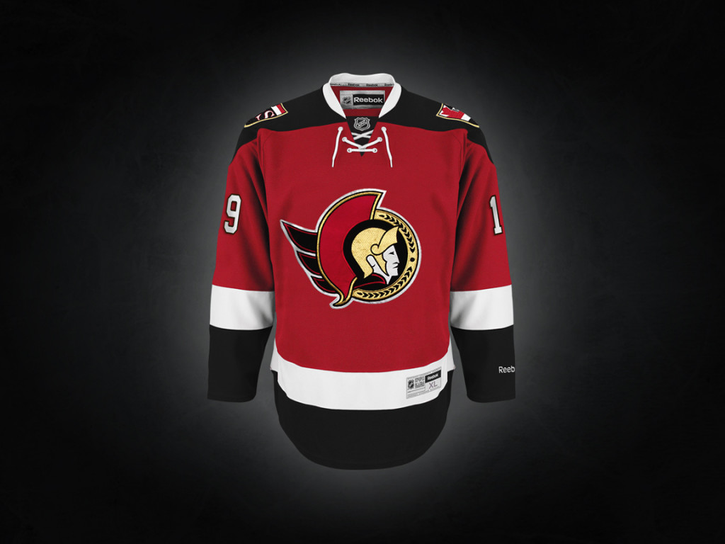
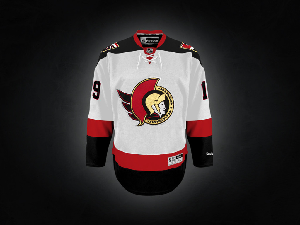
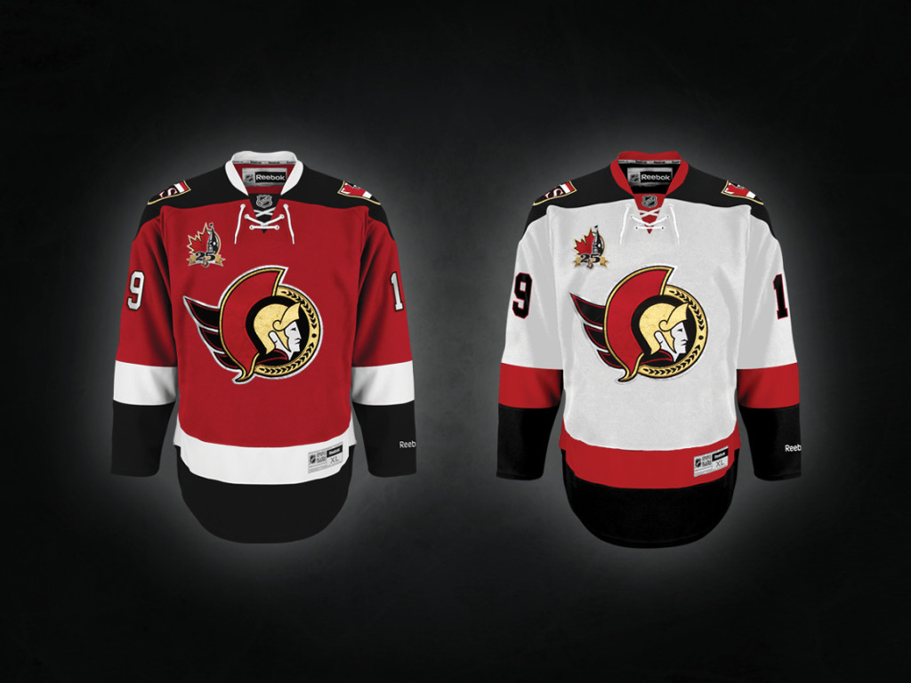
We felt that while the original black jerseys were nice, and they absolutely were, the 25th would be a good opportunity to explore all potential options. We had 25 years of logos and uniforms to work with, so while an all black home similar to the original was heavily considered, we decided to incorporate more elements of those 25 years. The colour red has been a big part of the Senators identity over the years and it has done well, so we tried a few things to see if we could incorporate it. Another thing, is that we felt the black/red/white horizontal pattern (i.e. barberpoles) was another element that served us well in the Heritage project, so while not as obvious here, we kept it intact: Black shoulder yoke, followed by red material, white band then black band bleeding into all black pants followed by another set of stripes on the socks. Like I said, it’s quite subtle but along with the Heritage alternate makes for consistency throughout all 3 uniforms, something we felt was important and very “Ottawa”.
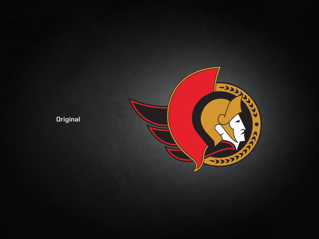
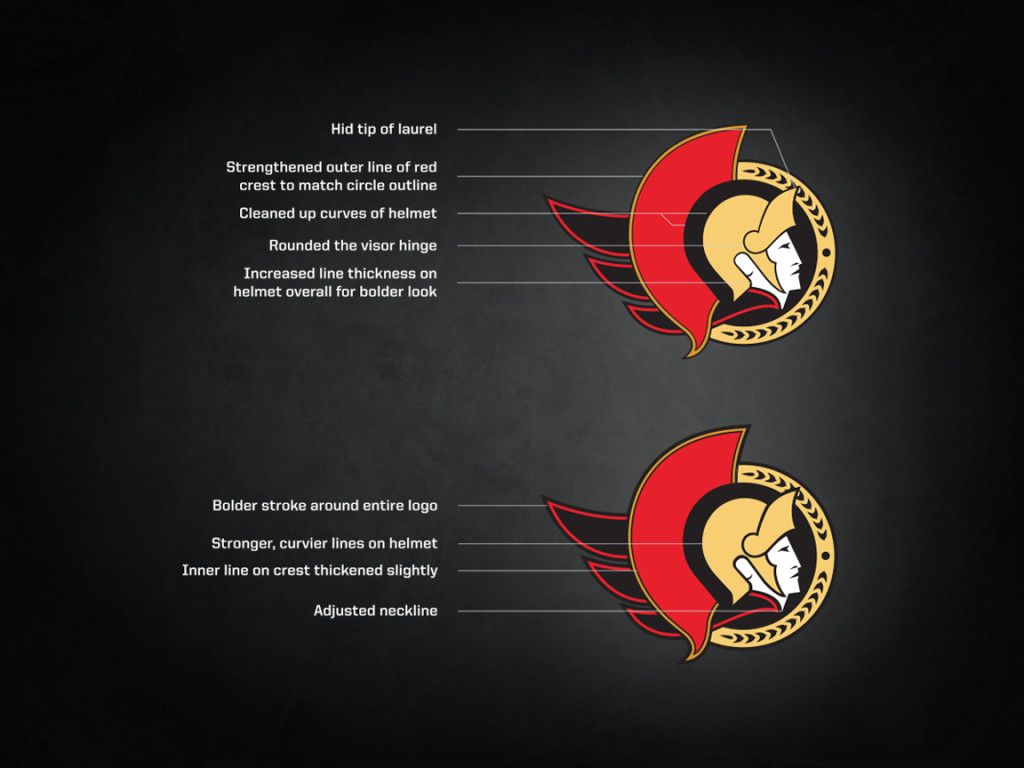
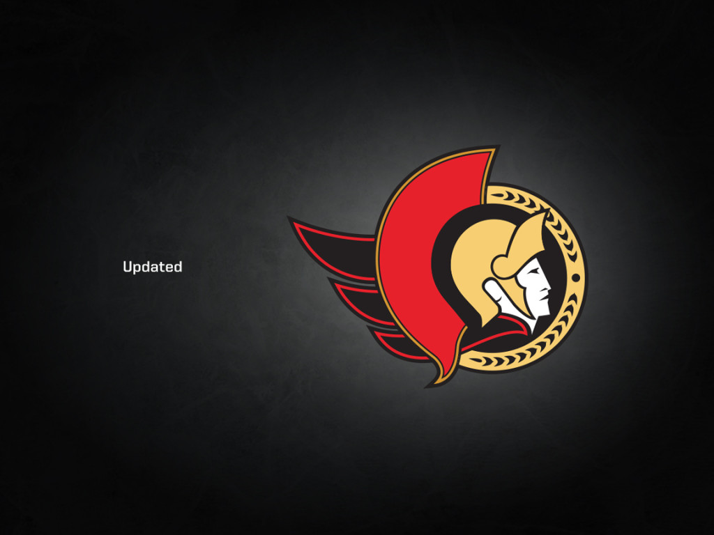
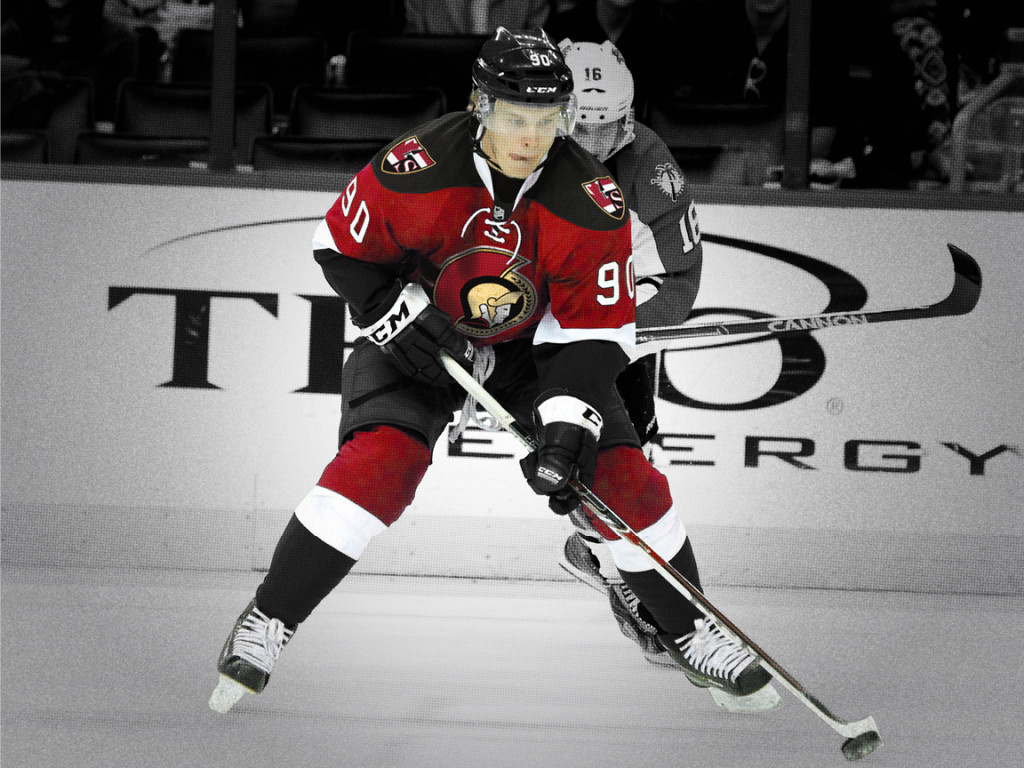
The two-dimensional logo has always been a fan favourite and that’s a feeling that is shared league wide. I often read comments from non-Sens fans wondering why we ever got rid of it. So without altering it too much, Marc did a great job at simply updating it so that it works better through a variety of applications. As you can see, they’re minor adjustments. We wanted to keep the logo as close to its original iteration as possible.
Also, just a note, some will wonder and chuckle seeing Vladislav Namestnikov in full Sens gear. Just to explain, the easiest way to photoshop the full uniform was by using Tampa Bay’s uniform as a base. Not breaking any trades or anything like that haha.
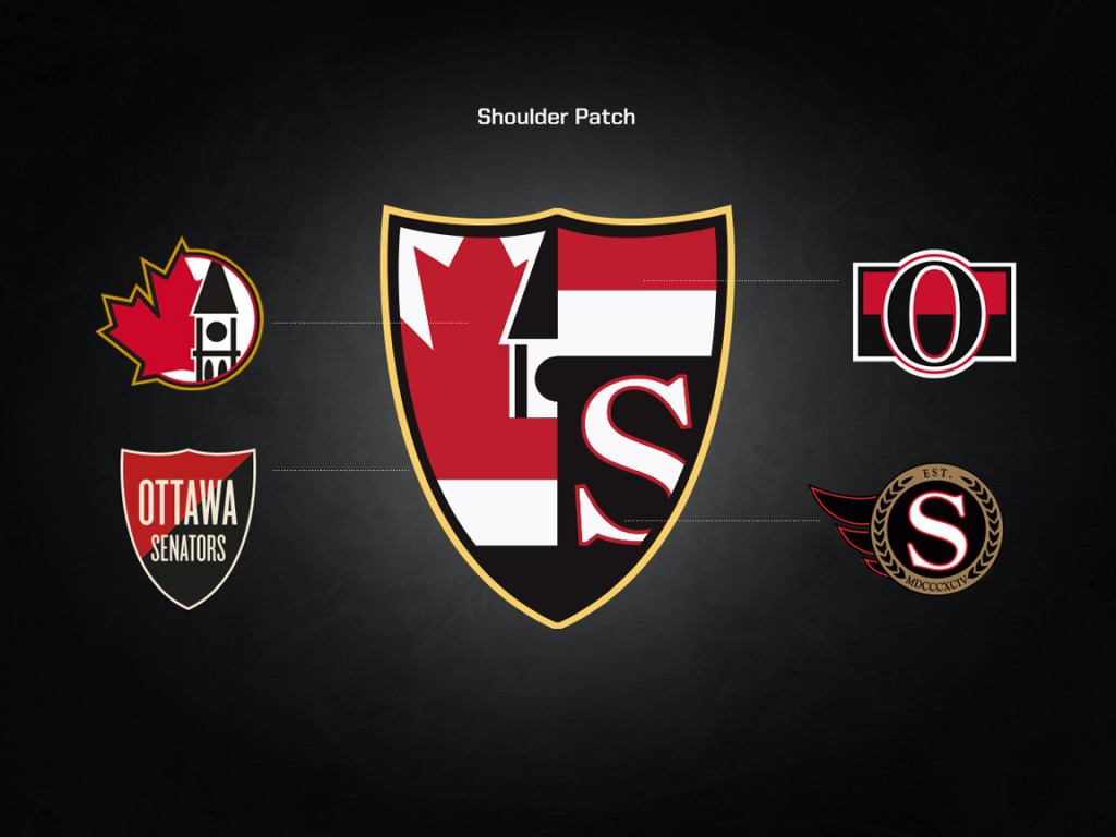
Q-The shoulder patch is one of the most impressive things about these concepts. The way you’ve incorporated previous patches into an updated look is really sharp. Talk about how that came together.
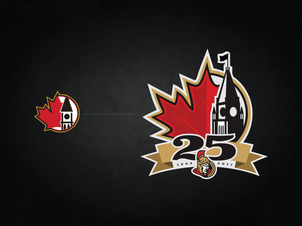
Ah yes, “25 years of shoulder patch” as I call it. We felt there had been a bit of a disconnect between the main crest and shoulder patches on the current set of home and away, with the cartoon on the front and the super traditional =O= on the shoulder, so we wanted the look and feel of both the logo and patches to somewhat match. With the 2-D logo being more traditional looking, we wanted to go that route. So we thought “why not try and figure out a way to incorporate all shoulder patches that have been used in the last 25 years” (we omitted the one from the SENS jersey as it was simply the main logo at the time). Fitting it all in the shield shape from the Heritage uniform gave the whole thing the shape we felt worked well with the main logo. Also, we feel it’s a nice touch to the history of the team and something that every Sens fan can identify with, no matter what year they started following them.
What would you like to see happen next? How do we make this a reality?
I’m not too sure to be honest. Things will be changing in the NHL in the not so distant future as Adidas will be taking over from Reebok. Adidas has done great things in terms of designing sports uniforms. I think people have been a bit worried about them taking over thinking they’ll incorporate 3 stripes everywhere, but if you look at what they’ve done, especially in college football, they have a strong understanding of uniform design, tradition etc so I’m not too worried. However, I feel that the 25th is such an opportunity for us to get it right, and we’re the ones (Sens fans) who know our own history and we feel we have the expertise to make our own recommendations of what we would like to see the team wear. It worked out pretty well with the Heritage uniform as it was extremely well received by fans, players and uniform aficionados alike. I guess we’ll see what the reaction is to this proposed look, and hopefully it develops an organic following the same way the Heritage project did years ago and the team takes notice. Maybe get a hashtag campaign going or something haha.
And now (for those of you that didn’t already frantically scroll to the bottom), a look at their ideas!

